
Directions from 2 Point-Layers#
Let’s put our routing skills to use in a real-world scenario: emergency evacuation planning. The question we’ll tackle: How can we identify the most efficient evacuation routes from populated areas to safe zones in case of a tsunami?
In this analysis, we’re looking at Victoria, British Columbia — the provincial capital renowned for its scenic harbor and historic architecture. Although Victoria is somewhat sheltered, it remains vulnerable to tsunami risk due to seismic activity associated with the Cascadia Subduction Zone. In the event of a significant earthquake, rapid evacuation to higher ground would be critical to ensure public safety.
Our analysis will focus on evacuation routes originating from key downtown locations, including popular cafes and landmarks, recognizing their importance as gathering points within the community. After all, in an emergency, no one wants to leave behind their morning coffee or local pastries. Using the “Directions from 2 Point Layers” processing tool in ORS Tools, we will calculate optimal routes from these points to designated safe zones throughout the city.
Add the layers in the evacuation.gpkg file to your QGIS project. The layer cafes
contains the evacuation points, while the layer mountains contains the safe zones in an elevated area. Then open the
Directions from 2 Point Layers processing tool.
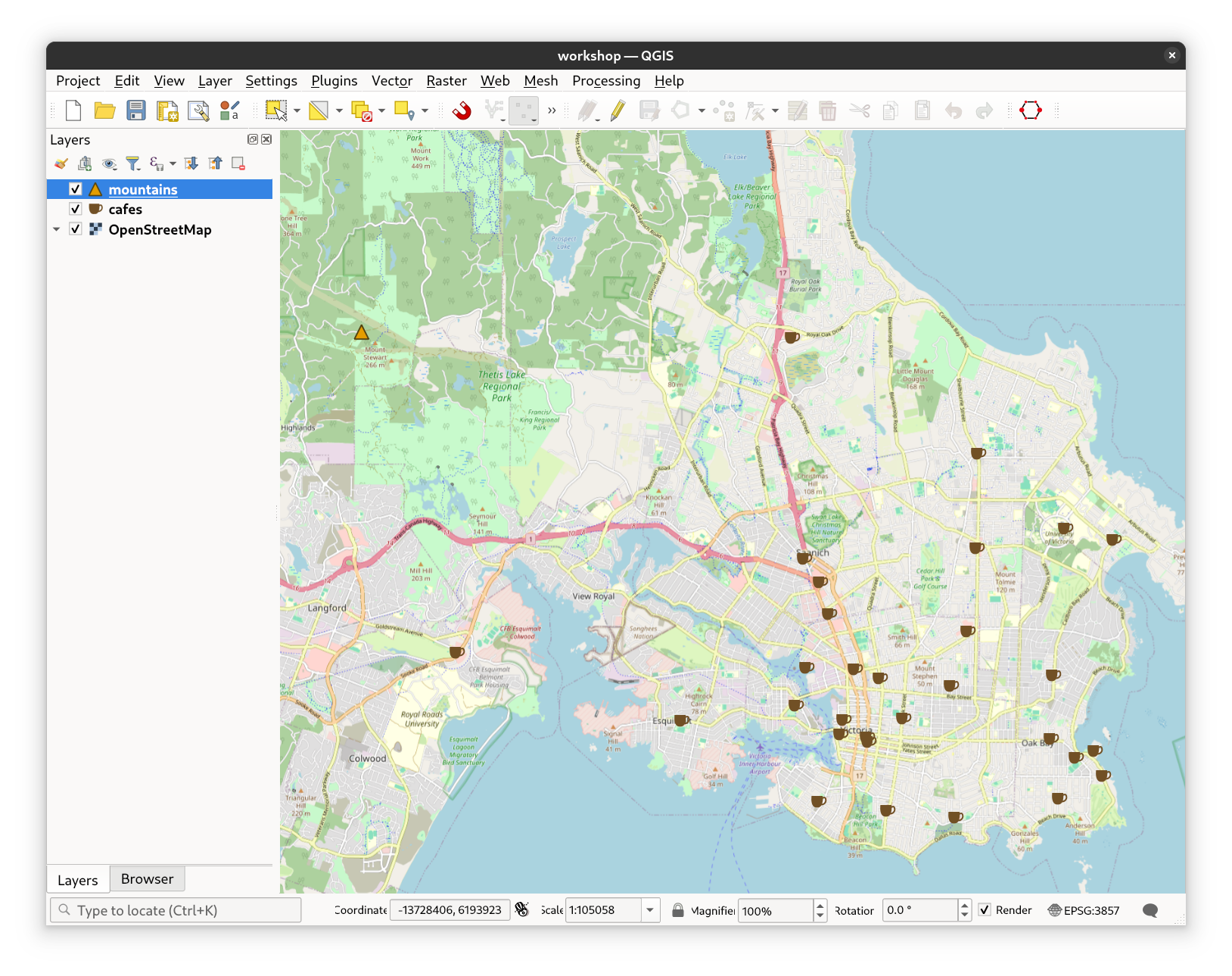
Fig. 32 The cafes and mountains layers in the evacuation dataset#
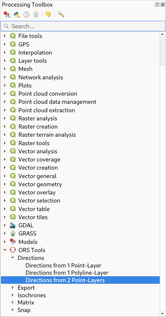
Fig. 33 The Directions from 2 Point Layers processing tool in the QGIS Processing Toolbox#
Set the Input Start Points layer to cafes, the Input End Points layer to mountains. Also set Layer Mode to
All-by-All, which means that all points in the start layer will be connected to all points in the end layer.
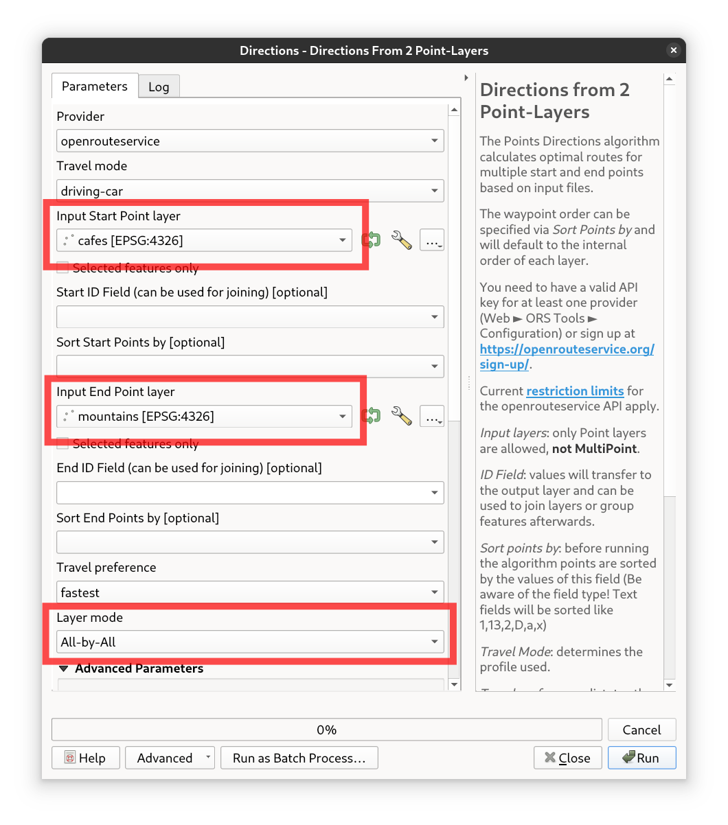
Fig. 34 The Directions from 2 Poins-Layers tool user interface#
And hit the Run button. The result will be a new layer with the calculated routes from each cafe to the mountain.
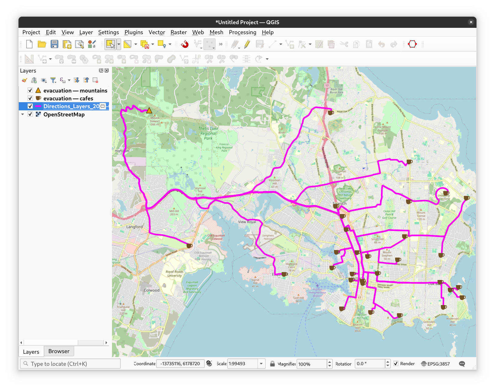
Fig. 35 The initial result of the evacuation routes from cafés to mountains#
Now open up the layer properties and increase the Line width to ~1.0 to make the routes more visible and choose a color that pops. Then, set the
transparency of the Line Symbol Element to ~ 10% and make sure to set the saturation to 100%. This will make all segments where there are multiple overlaying
line segments stand out more clearly, as they will be less transparent than the rest of the routes.
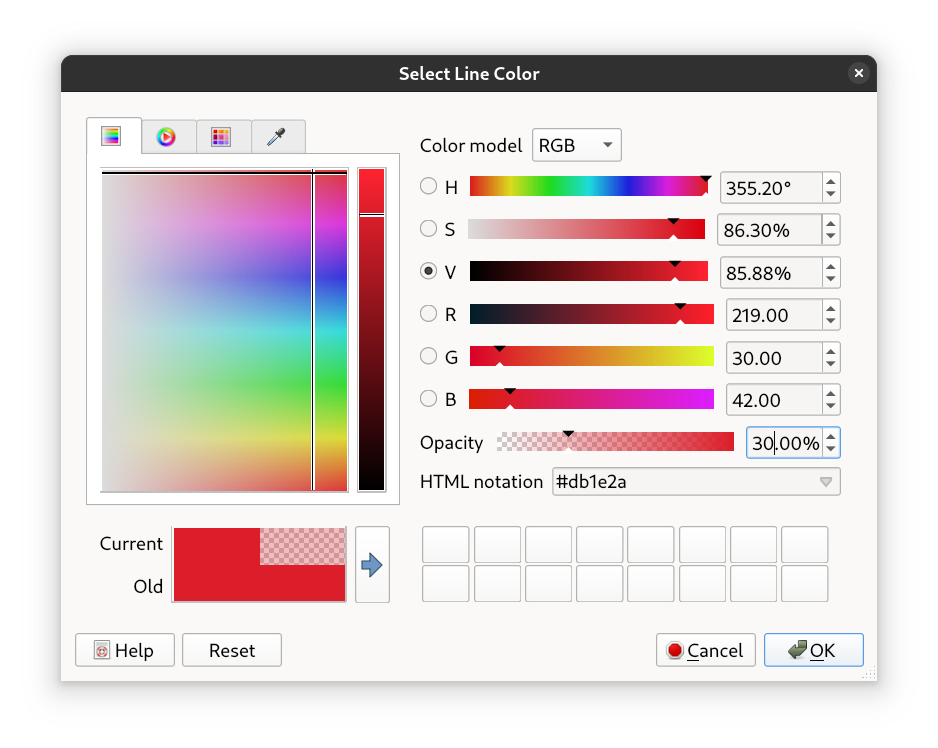
Fig. 36 The style settings for the evacuation routes#
Turn off the background map layer for better visibility. The varying transparency levels now provide a clear visual indication of route frequency - the more a particular path is used, the more opaque and prominent it appears.
If you’re interested in this topic and want to learn more about centrality, you can check out this page on centrality by the University of Heidelberg, which provides an accessible introduction, practical use cases, and guidance on how to compute centrality measures using real-world road network data. Centrality in this context refers to the significance and influence of specific road segments or intersections within a transportation network, helping identify key routes or nodes that optimize traffic flow and improve overall accessibility.
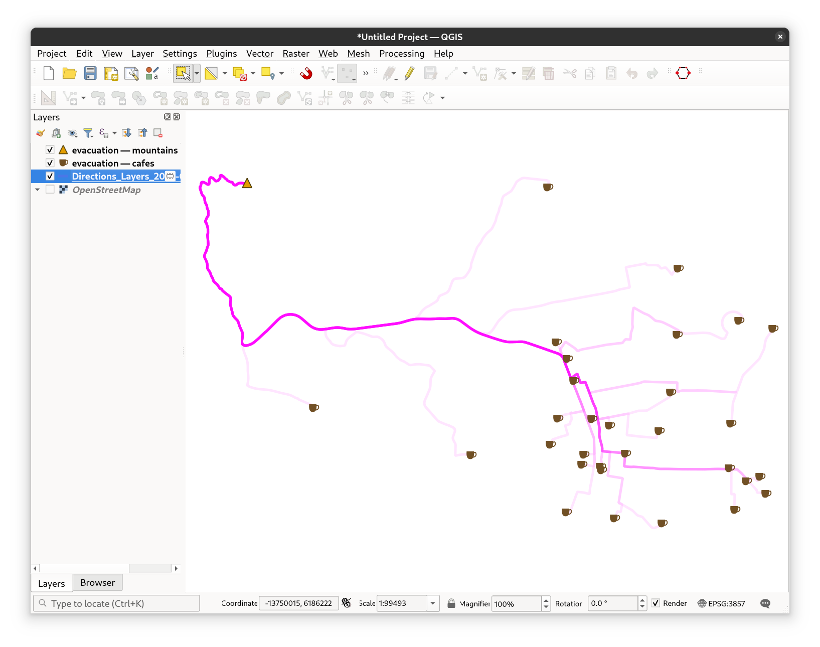
Fig. 37 The unobstructed qualitative centrality map#